UBS Mobile
Redesigning UBS Mobile to separate everyday banking from financial planning through a dual-mode interface. By giving users explicit control over when they're executing transactions versus exploring long-term goals, we reduced anxiety for beginners while maintaining efficiency for experts.
A redesign of UBS Switzerland's retail banking app, developed in direct collaboration with the client through the SUPSI MA Interaction Design programme. The brief was to identify a genuine usability failure and design a response grounded in research.
Client: UBS Switzerland
Type: Academic collaboration
Year: 2024 to 2025
Outcome: Awarded best in class
The Problem
UBS retail customers were not engaging with the app's planning features. Savings goals, product exploration, and spending insights sat largely unused, despite representing a meaningful part of the product.
Our research pointed to structure rather than motivation. The app had been organised around UBS's internal business divisions, not around how users actually think about their money. Transactional tasks and long-term planning competed for the same space, creating noise for users who simply needed to act, and anxiety for users who were not ready to plan.
My Role
This was a team project. All members contributed across research, synthesis, and design decisions. My particular focus was UI/UX design: wireframing the core interaction architecture, developing the design system, and building and iterating the prototypes used in usability testing.
Research
We conducted eight in-depth interviews with UBS retail customers and benchmarked six competing banking apps to understand where others had succeeded and where they had failed.
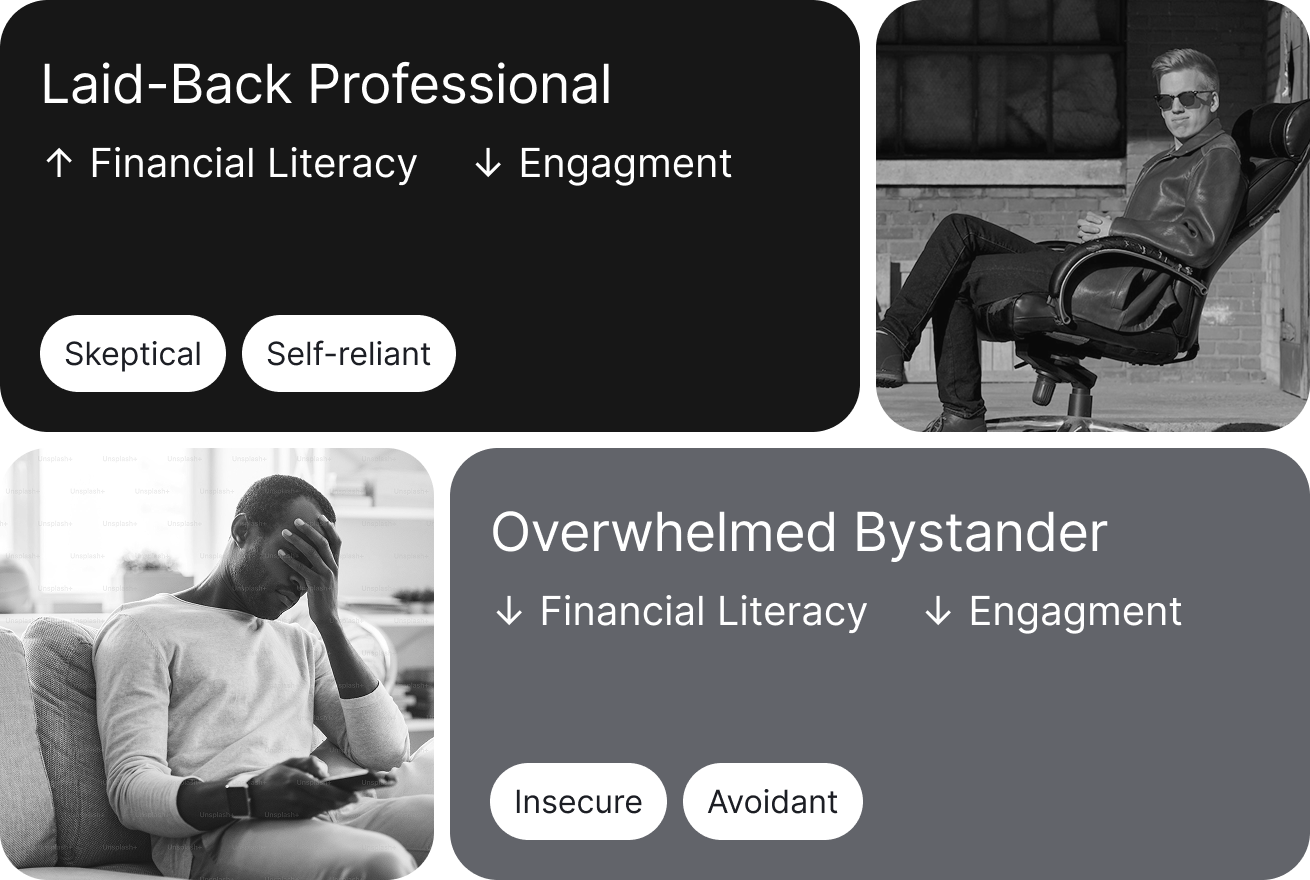
Two distinct user segments emerged.
The Laid-Back Professional is financially literate but disengaged. They know what they need and find the app's educational prompts patronising. They want to get in, complete a task, and leave.
The Overwhelmed Bystander has lower financial confidence. Words like "retirement" and "investment portfolio" on the home screen create enough anxiety that they close the app without acting.
The benchmark review reinforced a single key insight: adaptive interfaces that try to guess user intent fail because they are opaque. Users need explicit control over which mode they are in.
Design Response
The core of our response was a dual-mode architecture, controlled by a prominent toggle on the home screen. Act mode and Plan mode do not bleed into each other. Users choose their context before they enter the experience.
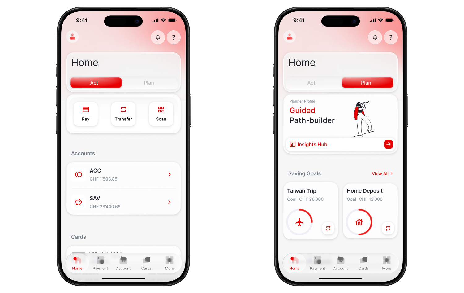
This was a deliberate choice against algorithmic adaptation. Rather than having the app infer intent and adjust silently, we made the mode switch explicit and visible.
Within Plan mode, we designed three modules, each addressing a specific failure point identified in research.
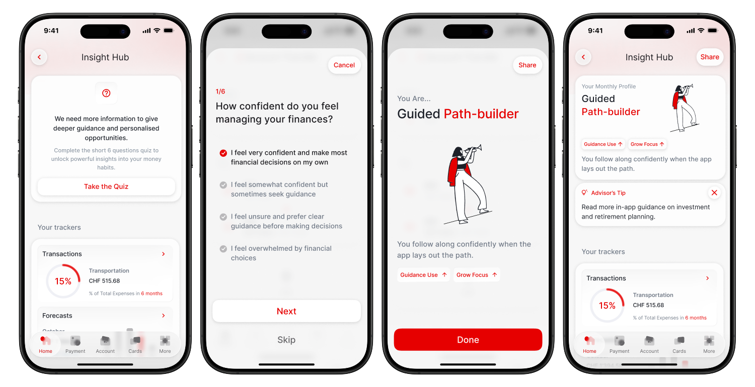
Insight Hub
Users with low financial confidence need scaffolding. Users with high confidence find it patronising. Insight Hub resolves this without requiring financial disclosure: a six-question behavioural quiz establishes a planning profile based on how users prefer to engage, not what they know. The app then adapts content depth and tone to match.
Saving Goals
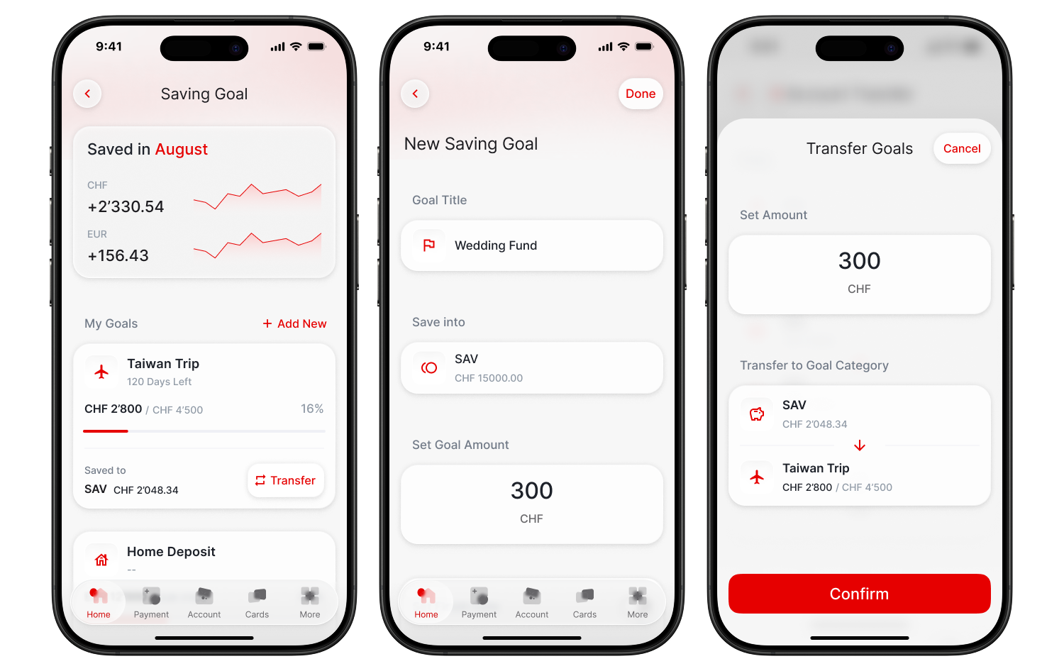
Financial goals feel abstract when progress is invisible. We replaced linear progress bars, which testing showed felt discouraging when targets were distant, with circular progress rings drawing from the same visual language as Apple Health. Goals are named, given icons, and linked directly to a savings account. A one-tap transfer button keeps action within reach without automating it.
Product Pathway
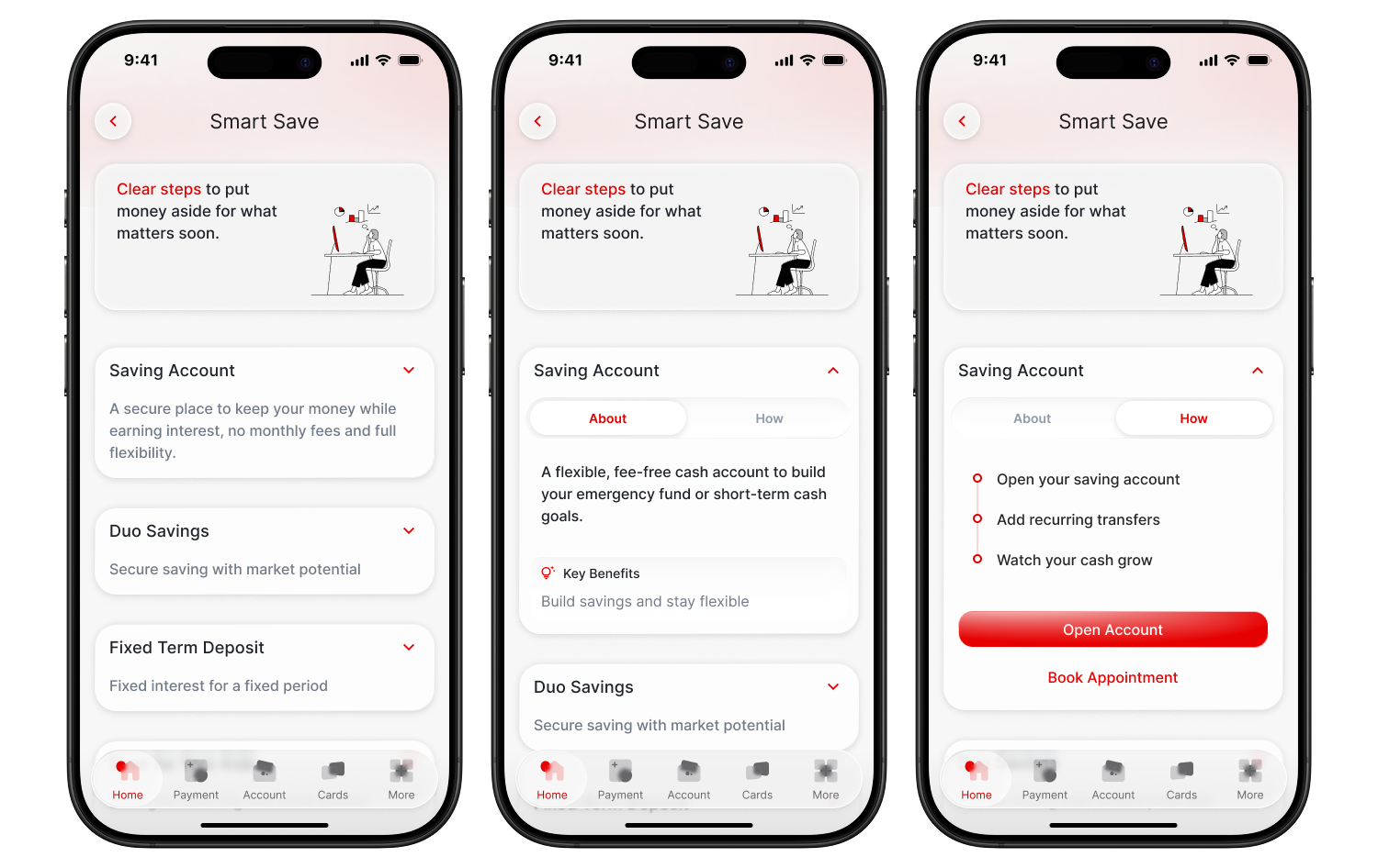
UBS's product catalogue was organised by internal business unit, which meant users had to decode the bank's own structure to find what they needed. We reorganised navigation around user intentions: Start Building Your Savings, Plan for Life After Work, Finance the Big Milestones. Each pathway uses plain language and breaks exploration into steps, with no forced commitment at any point.
Design System
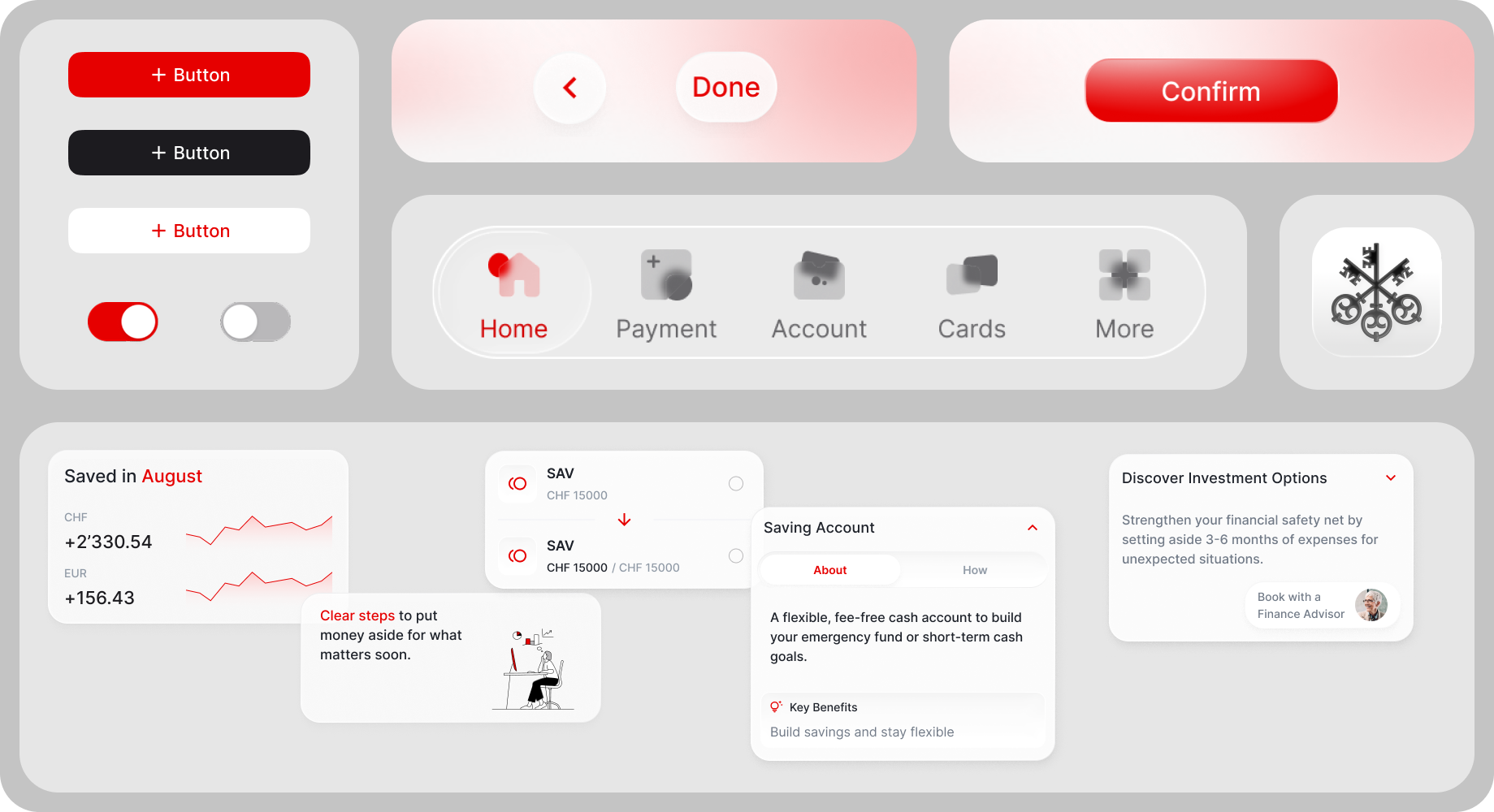
The visual system was built to reinforce the mode separation. Frosted glass cards establish hierarchy, with critical information sitting on opaque backgrounds and optional educational content floating on semi-transparent surfaces. UBS red is reserved exclusively for primary actions and active states. Plan mode uses a gradient background to create immediate visual distinction from Act mode's flat white.
The project was delivered as a complete Figma design system with component-level documentation.
Testing and Outcomes
We ran two rounds of usability testing with four participants across both user segments, iterating between rounds based on observed failure points.
The first round surfaced three problems. The toggle was invisible at its original position in the top navigation, so we moved it to the centre of the home screen and increased its size. Plan mode showed all three modules on a single scrolling screen, which users found as overwhelming as the original app, so we separated them into cards with individual entry points. The Saving Goal creation flow asked for too many fields upfront, causing abandonment, so we reduced it to two required fields and made everything else optional after creation.
Task completion rates across the two rounds:
Goal creation: 75% to 100%
Product comprehension: 50% to 75%
Mode switching: 25% to 100%
Reflection
The biggest design decision on this project was also the simplest one: give users a switch and let them choose. Every feature we built sat downstream of that choice. The research pointed clearly to the fact that the problem was not what the app contained, but that everything was in the same place at the same time. Separating act from plan created the space for both to work.